Monday, April 18, 2011

Critical Reflection Section 3

Critical Reflection

Clarity-
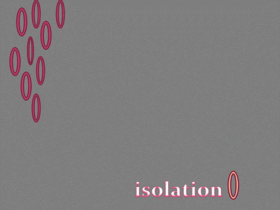
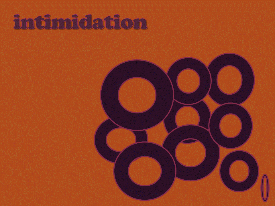
I have succeeded in presenting the thematic messages clearly and efficiently in the Typographical Conveyances.However ,each person has his own perception and thinking and  thus it can not be said with certainty that it will  not be misinterpreted.I have kept it very simple and do not think it needs to be oversimplified.

Audience-
The audience in this case is the college students and the teachers .I am not sure of their visual tastes  as I belong to another country and culture though I can guess that their tastes would be more contemporary and to some extent flamboyant while I have conservative and traditional taste. In spite of that, I think my work would be able to carry weight with them as it has a universal appeal and conveys the meaning quite clearly.

Purpose-
The main purpose of this presentation is academic learning although the larger aim is to acquire skills to use it in future endeavors.It is an interesting activity as it not only tests the understanding  of the vocabulary but also the presentation of that understanding in such a way that you feel that the words are talking to you. 

Critical Reflection Section 2

Critical Reflection -Section 2

Connotation-
I have tried to be consistent in keeping up with the theme and its components in consonance.I seem to have fairly succeeded though a lot remains to be achieved.As I mentioned earlier in my reflection,my problem is using technology effortlessly to create visuals as I imagine them .I can think of different ways in which I could improve on the graphic and fonts.I was really satisfied with the Word Portraits-' Ancient' and 'Naughty' as they are effective in conveying the theme.In the legibility and text safe areas, I could have changed the font style and effect and colour to complement the backdrop.The adjustment in the Hue and Saturation really reflects the overall theme appropriately.The theme is neither specific nor too broad because many different elements have been used.
Attributes-
I generally like the presentational styles of whatever I created.The elements do stand out clearly and seem to be in thematic agreement. While doing the icon,and drawing the violin, better line work would have enhanced the impact of the icon created.
Placement-
The placement is important as it enhances the visual impact of its components.I have generally placed everything in the center and maintained that through out.What I felt  was that due to lack of confidence in my technological skills and perhaps paucity of time,I have not ventured to try out different options before homing on to  the final product.I would have come up with better conceptual and aesthetic gains,had I  tried to put in more variety and taken the risk of using more tools in photoshop.

combining fonts and images

Fonts and Images

In this activity we were to create a logo for a company or business and use an appropriate font combining it with an image downloaded from the internet .I chose to design a logo for an opticians firm and used the eyes to depict the eyes as it concerns that part of the body .I created this in Powerpoint  using the font ' Wide Latin'.The result appears to be quite effective as I have used solid colours to convey reliability and strength of the product being offered as well as the genuineness of the services .
                                

Thursday, April 14, 2011

word portrait


This activity was designed to  use an appropriate font which would bring out  the  meaning of the word .I chose the word 'Ancient 'and used Stencil Std. font and gave it a dark colour to give depth.The second word I used was 'naughty' using the font Jokerman' which seemed very appropiate in conveying the meaning .  

typographical designs

typographical design  


We were asked to use typography and convey the meaning of the word.Type face and fonts are very powerful mediums to convey a feeling or suggest meaning and essence of the word.It is a great tool for designers and visual artists as each typography has a language and vocabulary of its own.In the case of Pillow I tried to use the letter 'o' to give the image of a pillow. For the word lightly,the use of light blue colour , with the two letters  - 'l' and 'y' kind of lifting into the air to give the effect of weightlessness to convey the meaning. The word Brick  has to show strength and solidity , hence the bold typeface with an outline to show rigidity and firmness of shape. The word Shred is conveyed through the letters dropping off one by one as if being shredded. I used  the effect of perspective to depict the increase in size with 'l' depicting extra large. Atom is shown through the typeface  which has no sharp edges and the letter 'o ' kind of conveys an image of atom.

digital storytelling

For this activity we were asked to pick up five images and adding a few texts we had to create a  digital story. I used a few pictures and tried to tell a story of the day  I was in San Francisco and the threat of Tsunami loomed large at the Pacific coast . I used Power Point to insert pictures, four of them from  the internet and one of Yosemite Park taken by me . I put them together on five slides and wrote some captions to form a link .It turned out to be quite interesting.  

Tuesday, March 22, 2011

Legibility and Text Safe Areas


We were asked to download a picture from the internet which we could use as a backdrop to a text message.  I downloaded a picture showing flowers and  effect of flow of water. Then using the photoshop medium ,I wrote a word in the style and font which would appear a part of it and not contradict the background.The layout was in a wave form to complement the mood of the backdrop.I think the text kind of blended with the background and is looking stylish.

Colour Echo

Colour Echo

We first downloaded a picture from the internet to work on it .I downloaded a balloon and working in the photoshop, I deleted the background by selecting the 'magic wand' ' clicking on the backdrop' and then pressing 'delete'.I pressed select and deselect to remove the dotted line.Next using the eyedropper tool, I chose the colour of the backdrop from the colours of the balloon on a separate layer and added text to it.


 Using the rectangle tool, I created different horizontal stripes and chose the colors from the balloon.This activity can be used to create a harmony between the image and the palette.It will enhance the overall effect of the design. 

Hue and Saturation

Hue and Saturation -

  We selected a colourful  picture from the internet and and tried to work around the different shades and effects of the color. In  photoshop, using adjustments,  I first changed the hue to +128 by dragging it to the extreme right  and could see the change in the look of the picture.


 Next I changed the saturation  to -81 and again the effect was dramatic. So a variety of colors can be created by changing the hue ,saturation and value of a color as is evident from the activity we did.This is of immense use to create effective images and pictures.


Second Life Prim


 Second Life Prims

We were asked to download a software called Second life which is a 3D virtual space where you can have an interesting experience.Further we were asked to create an object , for which instructions were given which made it easy.I went to' build' and 'create tool'  and chose an object 'a cylinder' and selected a name for it.I added texture and glow to it.I also manged to change the clothes of the person supposed to be representing me.I could move ,rotate and stretch the object. 


In the second picture ,I stretched it and added a texture to it.Second life is an interesting concept and a great learning tool. 

Sunday, February 27, 2011

Composition - ICONS

Icons-

    ''The ultimate goal of an icon is to convey a message ,quickly, clearly and in a manner that is aesthetically appropriate for its purpose and target audience.''      Krause

                  We were asked to download the picture of an object .Then we had to create an icon .We first tried to look at the important feature of that object and then to highlight it in a simple manner to convey visually the message of the icon .I downloaded the picture of a violin and then went on to create something similar but in simple forms in powerpoint. For this I selected required shapes and placed them as needed. I also placed the icon in a box. Next I went to the photo shop and using crop tool removed the background.


gestalt theory

Gestalt Theory

           Gestalt principles is a psychology term which means ''unified whole''. It refers to the theories of ''visual perception'' which attempt to describe how people tend to organize visual elements into groups or unified wholes when certain principles are applied.

Closure-

        The mind may perceive elements it does not perceive through sensation , in order to complete a regular figure.So a closure occurs when an object is incomplete or a space is not completely enclosed. If enough of the space is indicated , people perceive the whole by filling in the missing information. As can be seen in the example below, the four figures are not touching each other but  we  can see the square formed by them .I created this using power point and photoshop.I first selected  a shape in the power point and placed it  in the following manner to create a vision of a square.Next I used crop up tool in the  photo shop to cut off the extra space around the figure and to bring it in the centre.

      
 Similarity

       Similarity occurs when objects look similar to one another .People often perceive them as a group or pattern.In the example below there are different objects  but appear as a single unit because all of the shapes have similarity .When similarity occurs , an object can be emphasized if it is dissimilar to the others.I used the same technique for this by using power point to select a shape and placing them in a certain manner. Next with the use of crop tool of photoshop I placed it in the centre by removing the extra space around it.                                


Wednesday, February 23, 2011

Critical Reflection


         It is time for critical reflection on the activities under Composition where we have posted work showcasing Horizon Variations, Grouping ,Theme, Colour and Emphasis ,Golden Section and a reflection on the seminar on GeoSpatial Techniques. I must admit that when I started out, I was totally at sea and did not really understand what exactly we were doing or supposed to do. However, after persevering and  pushing myself to understand the big picture, it gradually dawned on me what Visual Literacy was all about and how to connect the dots of the various activities that we were doing. So my initial critical reflection of my blog is that I am very proud of the fact that at least I am able to put it together and post it. Since I have very basic knowledge of Computers,  just to be able to give a visual to my ideas, however imperfectly,  has boosted my morale and has given me the impetus to further enhance my skills.So a pat on my back before I look at the shortcomings.


Connection-


 When you look at the complete picure, you realise how different elements, images and techniques in unison make an impact. I have tried to keep the blogs simple but effective. I really liked the one I did on Grouping because that was a totally self created visual and required us to use our comprehension as well as artistic instincts to convey the meaning of the given terms. I think I lacked consistency in maintaining the font size and type ,since when I started I did not visualise the final picture.But now I feel a bit of adjustment in the size of text and pictures would have made a better connection within the entire blog.There would have been more continuity and flow.


Alignment-


  The alignment is continuous throughout and seems to have a kind of flow, though there are certain anomalies which when removed can improve the end result. I could have tried to put a little variation by left and right side alignment and resizing the pictures to make it more proportionate to the text. I have put the narrative with each work to explain my thoughts and purpose for choosing that particular style.I had certain ideas in mind but lacked the skill to do it .I am still grappling with the technique to be able to present exactly the way I visualize it in my mind.


Priority-


    I have used green colour in the background as it is my favorite colour and also I find it to be a very soothing colour.The light green background stands in good contrast with all the work that has been put up. I think all the blogs are critical to our understanding of Visual Literacy and its implications ,so I do not think I can really prioritize the work on any basis. Every activity we did has a special significance and pertains to the acquiring of skills required to make an effective visual . Each element has a significance in completing the picture and making it more wholesome. 

Tuesday, February 22, 2011

Colour Emphasis

COLOUR EMPHASIS

    Today we did an activity to understand how something can be emphasized to highlight it or to focus on it.This we accomplished with the help of playing with color techniques.Our choice of colour can assist in making something stand out visually or alternatively to play it down by merging it in subtle or sober hues.

    In the first activity ,we were asked to select an image and after making multiple copies of it  ,to re-colour one of them to visualize the impact of use of color .I chose a toy bear and in Photoshop after magnetic lassoing , moved it on to a new file to create two more.I then proceeded to use adjustments to change the colour of one of them .If I had more of the red coloured toy, the effect of the odd one would have been even more dramatic.It would have enhanced the stark contrast.In any case the lesson learnt is that impact can be easily and effectively created using  the appropriate choice of colour.  

          PAST AND PRESENT-

        We were asked to select a photo,preferably of a street, and turning it into black and white except for one of the images on it. This would create a magical effect of merging the past into the present giving it a dramatic effect.I chose a busy street picture of Mumbai city showing lot of people. I then proceeded to magnetic lasso two people in it and then selecting inverse and going to new adjustment layer, I turned the picture into black and white. Only the selected picture of the two people remained in colour and the rest showed a scene of the past. 


        Since I really enjoyed doing this activity, I tried once more to create this effect of the past meeting the present.This time I chose a street of Kolkatta city and magnetic lassoed the car while turning the rest of the street into a dramatic black and white. The result has been a bright yellow ambassador car in stark contrast to the sepia tainted picture of the past.The effect is instantly dramatic and capable of conveying any visual message or interpretations  that the designer wishes to portray . 


Saturday, February 12, 2011

Alignment


Alignment


   " Alignment between elements can be used to create a sense of agreement , soundness and unity within a piece, regardless of the tone of its overall message." ( Krause )

          
             I have chosen to create this ad for a lamp company .I liked the placing of the lamp as a centered alignment.Even the lettering of the heading and the sub headings has been kept centrally assigned to give a sense of proportion and also emphasize the lamps beauty as well as the name.For the logo I used the same color as the background of the lamp with the yellow effect added to it to complement the colours of the lamp.The grey background was used to enhance and emphasize the description used  'sparkling '.

          
        I have used the same technique of centered alignment for the second example also.It is a common and conventional approach and an effective one if used  appropriately.

Grouping

Grouping-

                Whenever things or objects are grouped together it has the power to create ,to leave an impact or to express  feeling or emotion or convey a message. So effective grouping is a very potent  tool for designers ,as such imperative for us to understand the dynamics of it.We were asked to select a shape from powerpoint and through grouping patterns , colors and word art we had to create seven slides representing-Unity, Isolation, Escape,Intimidation, Logic, Celebration and Anarchy. 


                  In this slide, I  placed the doughnut shapes in a circle to express solidarity with each other , as if they are standing up for each other  and  the discipline of uniformity and conformity thus conveys a sense of unity.

                
     In this slide, all the doughnuts are all over with no proper order or grouping or position and even there is no correlation of colour , all of which conveys anarchy. I have applied the same technique even in the word 'anarchy'.

             The isolation of one doughnut is self evident in this slide. The different colour of the isolated doughnut  denotes that the reason for isolation could be being different from others .The use of grey colour represents gloom at being isolated.


          The slide denoting escape is using the analogy of the birds and the sky .They are free to escape in the vast blueness of the sky.

                            For the slide on intimidation , I have varied the size of the doughnuts except for one thin one which is a weakling who is being threatened and used a colour which represents 'menacing' quality. I have tried to create similar effect in the heading also through shadow effect.  

                For logic I have chosen a shape which kind of fits into each other and has a method and an order  denoting how logic works .The font used in the word art also denotes a stable and sensible thinking skill.

                    The last slide depicts Celebration for which I have used smiling faces and bright colours  to convey joy and happiness . I have grouped them in the shape of a smile.                             

Horizon Variations

  Horizon Variations-

    Exercise 1 - 
                        Krause in his book 'Basic Design Index' says ''varied measurements around point of interest tend to heighten the visual interest and energy of the piece and convey a sense of creativity." To understand this concept we were made to do a simple exercise.We took a sheet of grid paper and we had to place dots in different places such that they were not equidistant from the vertical or horizontal sides of the paper.The unequal placement of dots heightens the aesthetics and creates different patterns which convey different feelings and thoughts.

  Exercise 2 -

                       In this exercise, we were given two photographs and through Photoshop techniques we had to crop up the photographs to give it a different meaning. In the first photo,I cropped out a part of the sky as otherwise the picture did not really have a focus. At the same time, there appeared a lot of clutter of the electricity poles ,which were adding to the confusion. Now the focus is the road and it gives a feeling of going on a journey as you feel you are in the driver's seat . There is a sense of movement and  a sense of belonging.  


                      In the second photo,I cropped out a portion of the road ,which shifted the focus to the sky, to the height of the buildings and the lampposts , which further enhanced the visual impact of the sky. We realize that just by shifting the horizon up or down in a photograph ,we can visually attain different perspectives.  It is a great help when we are trying to emphasize on something and want to create a certain impact.  

Wednesday, January 19, 2011

reflections on google earth and geospatial projects-18 th Jan. 2011

Mr.Kevin Borg's visuals  [  ref.-presentation on Mapping Historical Resources ]  were representational where he superimposed the historical maps of  Harrisonburg on the Google Earth maps and what came through was a comparative study of how the city developed over time.He scanned the old microfilms and through photoshop and rubbersheeting  [  new term  ]  managed to superimpose it on the google earth maps...saved on kmz [ new term ]  files.It was almost an accurate representation because the maps were from  authentic sources.The visuals enhanced the knowledge of how much things had changed over time and which buildings were there before and later ,at a glance.The intended audience would be history students and those interested in it,also town planners and conservationists. There was no voice over.

   The presentation by Mr. Steve Whitmeyer on Interactive Geologic Maps of Virginia and  the Shenandoah Valley Region made use of  arbitrary graphics showing different layers of rocks/earth surface /geologic eras through different colours and shades.The purpose was to make integrated multilevel geologic map of Virginia with lot of details as one zooms in and links to add to the information .The audience is the Geology /Geography students and people in the mining  and construction field.The visuals not only represent the different rock structures but by tilting the view  you could also see the cross section of that area.Through links more and more environmental information is being added. I do not know specifically which software program was used.

technology

       
     I have just created a blog and want to share my thoughts .............technology is interesting as well as perplexing ......so much to learn...........so much to catch up  on..........by the time you learn something it is time to unlearn  because new things have been introduced................